A booking platform for mobility providers

Iomob is a platform that enables people to discover, plan, book, pay, and fulfil any mode of mobility, anywhere in the world.
Context
Company and product
Iomob is an early-stage startup building a white-label solution that enables enterprises specialised in mobility to provide a full customer experience without building their own.
The platform can create a trip to any location on Earth which will consist of whichever method of transportation will get the user there. From a scooter to a plane, the idea is.
Goal
Build a solution that enables users to find routes, plan trips, purchase tickets, book mobility services and aid with directions until they reach their destination.
For mobility providers, we needed to provide a better user experience than their current products.
Scope
There were several challenges to over come in a short amount of time that were not exclusive to:
Design a fully featured product with multiple integrations
Conduct user research to understand who would be the target audience and gather feedback about the user experience
Secure more funding and find the first client
Team and role
I was the founding designer working closely with the founders to translate the vision into a product experience.
Worked in a cross-functional engineering team with an external mobile developer
Achievemets
Built product prototypes to use for investor pitches
Rapidly went through many iterations as our product knowledge grew and more use cases were found
The design prototype helped secure the first customer and launch a pilot program
Organised and facilitated many rounds of user testing at different stages of the product development
Worked together with a mobile developer to implement the design for the first release
The Pilot
This was used as part of a pilot project for a client to understand the feasibility of the solution as well as to understand the impact on client operations. The app was given to around 50 people.
User journey
For an application to make sense, it has to tell a story step-by-step. To have an end-to-end route that would touch on most of the features of the app, we chose a route that took the user from their home to a place in another city. This would illustrate a door-to-door trip consisting of 4 different mobility types:
Scooter
Public transport
Train
Taxi
This helped us keep the focus on the users’ trip experience and not allow scope creep.
Information architecture
Information architecture should mimic the experience users have while using the app. This also allows to keep track of different touchpoints and allows a more holistic view when adding new features.
User testing
Continuous user testing provides feedback for growth.
After tweaking the concept for a while, we set out to validate the prototype with real people and answer a few key questions:
Who will be our main users?
Does the flow work for them?
What features are missing?
Would this replace any of our users’ current apps?
Because we didn’t have a budget for proper user testing, I employed Guerrilla Usability Testing principles.
I went to public spaces in Barcelona like Arco de Triunfo, Parque de la Ciudadela and Plaça de Catalunya with a prototype loaded onto an iPhone via MarvelApp and a list of tasks for our potential users to accomplish.
Iteration after iteration
Changing code is expensive; making design changes is not.
At a fast-paced early-stage startup, the only way to know if you are going in the right direction is to test your assumptions. As our hypothesis grew, every product iteration was user-tested and improved based on feedback.
“Design is a messy and ever-evolving process.”
MVP
This version was used to align on a feature set and to user test the app in real world scenarios.
Personas
During the different rounds of testing I found that different users cared about different features and had different goals.
Tourist
To plan a multi-city trip later in the year
Buy tickets for the whole trip in one place
Direction guide to help reach a destination
Frequent traveler
Convenience of easily accessible tickets
Have all mobility providers in one place
Schedule & book a trip in the moment
Business traveler
Book a taxi in the same app as the train
One place for all business travel-related expenses for reimbursement
Convenience of easily accessible tickets
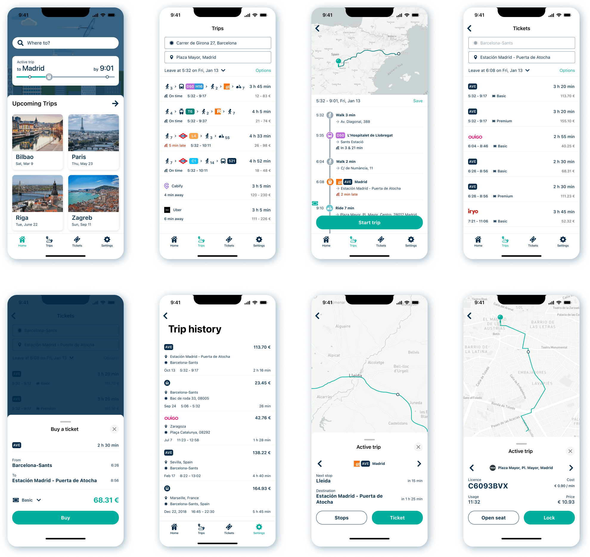
Main features
Upcoming trips
Upon opening the app you can see your upcoming trips. The information can come from your email, calendar or any pre-booked tickets.
Any mobility type
Several mobility options are available to match the users’ commuting style.
Plan a trip
Build your own trip, customise each leg to match your traveling style and book your tickets in advance.
Many points of entry
“Users rarely follow a full user journey or even start on the screen I expect them to.”
Instead, users would start a trip and try to conserve battery by locking the screen. The app would be opened only when necessary to check directions or get to their ticket. Users expected to continue from the last screen they were on.
This meant that each leg of the trip and the app, in general, should be built as a modular experience.
Final Thoughts
“Ah, that’s fantastic!”
Said a user once during a user test when they experienced the value of being able to buy a ticket for the trip they wanted to go on because they expected it to be a different service.
It is a rewarding experience to bring value to a person’s life, even if it is just a bit of convenience.