AdType
As the first designer, I designed a tool to visualise client commercial and marketing data, helping internal teams provide in-depth reports and decrease time to onboard new clients.
Data visualization
4 months
2018

Key achievement
I designed an internal data analysis tool that ingested client data and generated detailed reports to help them understand the business impact of our marketing campaigns.
A bit of context
AdType, a digital marketing agency, dedicated a significant amount of time to manually create reports for clients during the sales and onboarding process.
For new clients, these reports help build trust by showing how specific marketing activities impact different parts of the business and suggesting areas where improvements could be made.
For existing clients, they offer a clear way to regularly review and communicate the agency’s performance.
Automate a labour intensive process
Creating each report was a bottleneck for the agency.
Senior analysts would manually gather, clean, and consolidate data from client systems, upload them to tools used internally and compile insights into spreadsheets to create reports.
I was contracted to design an internal tool that would help analysts automate report creation and continuously monitor campaign performance through integration with client systems to free up analyst time for other work.
I needed to understand which metrics are important and how different data points can be combined into purpose driven dashboards. Each metric should be put into the context of the previous period and provide an insight into next actions.
Needs vs. systems
I conducted a series of interviews with colleagues and a client to understand issues with the current process, potential challenges and the purpose of this tool.
I learned that the tool would be designed for senior professionals in sales, marketing, and management roles, internally called "marketers."
Internally, the tool needed to provide a single source for customer data and actionable insights within the context of the previous period.
Externally, the tool needed to show accurate data, allowing clients to independently understand the impact of marketing campaigns on their business.
Senior stakeholders want to transition the agency from spreadsheet driven to a digital tool that could scale the sales process.
Balancing competing but complementary needs
Sales people want the report to tell a story about client business performance, what trends can be observed and where to target a campaign.
Analysts explained that client datasets came in various file formats, often as spreadsheets. The data required cleaning, normalisation, and adjustments.
For sales calls, clients typically provided a dataset, while existing clients granted access to their tools. Analysts also assisted in organising and uncovering supportive data.
The tech team emphasised the complexity of importing different types of data to gather insights. It needed to be combined and processed with calculations before it could be accurately visualised.

Clients are locked into insufficient tools
While exploring products clients used for marketing, I understood that they don’t provide sufficient information to make decisions which is why this task is outsourced to agencies.
Looking at other tools in the market, I learned that usability and ease of use are not a priority. These tools mostly provide different tables with very little context. They are expensive to set up and require training to use.
Client systems usually did not provide sufficient insight and exported messy data.
Building a source of truth
At the beginning requirements were scattered in spreadsheets, various documents, and paper sketches of charts and graphs. I gathered all requirements into a single document that served as the source of truth going forward.
Aligning stakeholders was a particular challenge since there was a tendency for requirements to change mid-development delaying a release and creating frustration in the engineering team.
I organised a series of workshops to outline requirements, get buy-in for the source of truth document, and agree on a roadmap.
Putting it together
Since there wasn't clarity on how things should function, I started to put together wireframes one section at a time. I iterated quickly to minimise the time for approval and keep stakeholders engaged.
Sales people often instructed specific data to be included in designs so it would make sense to them what they are looking at.
Each report would be data heavy and usually explained to a client by a sales person, so I wanted to highlight key insights as a readable story.
For the following reports, the challenge was to create reusable components of cells and tables so that they can be used consistently for other reports.
Requirements needed multiple approvals to give engineering the confidence that changes are not expected.
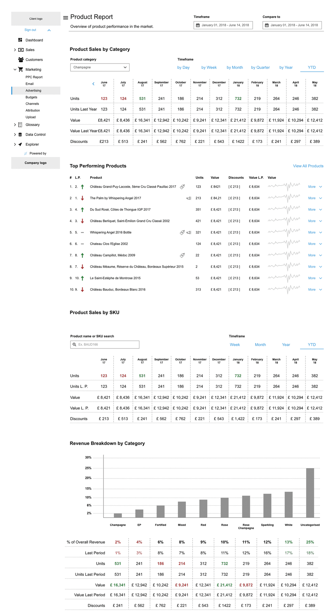


Modelling revenue growth
The first report I created represents the overall revenue generated by different inputs.
The dotted columns are projections based on the inputs below. By adjusting any input, a marketer can model different potential outcomes. Inputs that come from the dataset are not adjustable, only projections are.
Each projection can be saved or exported to a PDF to share with clients. In the future, the idea was to share a link to the report, instead of sending a document.
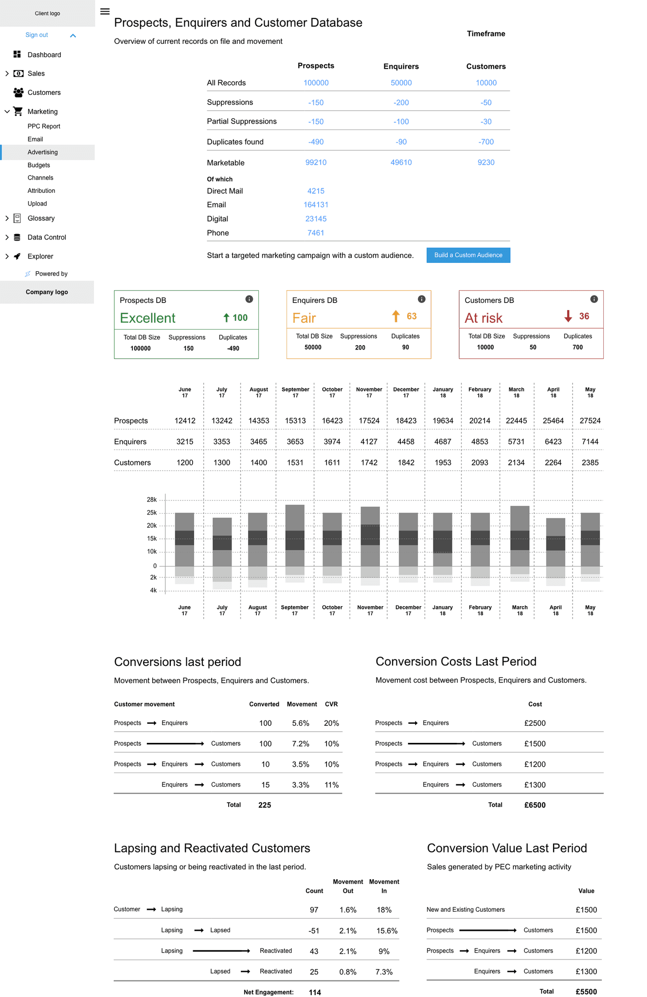
All reports were segmented into 6 types of customers: Prospect, Enquirer, Customer, Lapsing, Lapsed, and Reactivated

Managing consent
Since the appearance of GDPR, managing customer databases has become more complex. Large organisations risk fines for marketing to individuals without consent.
As consent is not permanent, visualising the current state and ongoing changes in the database became crucial.
Consent was managed with re-engagement campaigns to specific consent segments to keep leads active.
Getting a new customer is more expensive than keeping an existing one.

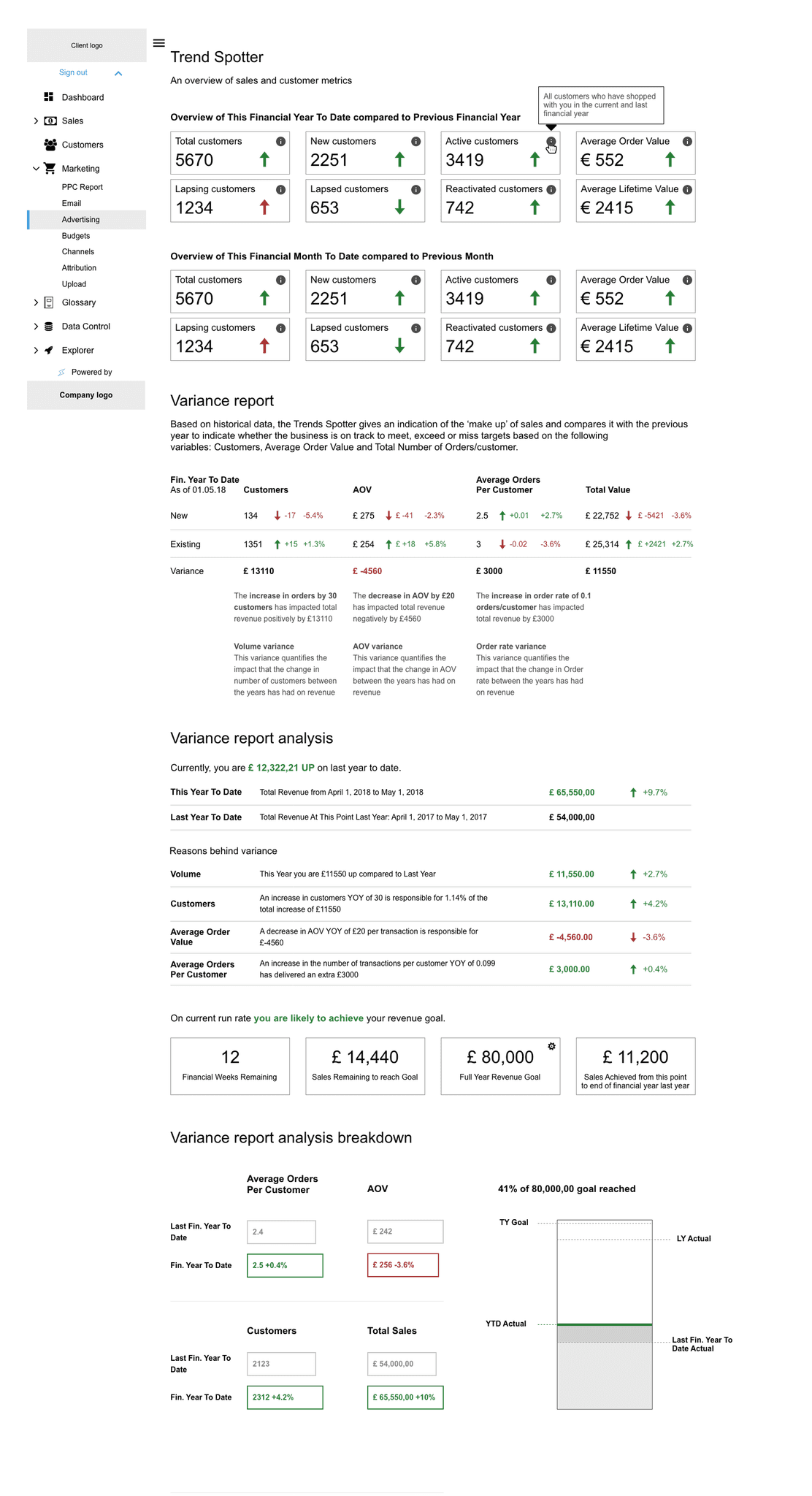
Spotting trends
To assess performance and determine if campaigns are meeting goals, data must always be viewed in the context of the previous period.
Since this is a data-heavy tool, the original plan was to make it similar to Excel, since that is how other tools in the space were designed.
I was able to include additional explanations for some of the data because I knew that not only senior people would be looking at these reports.
Translating data into insights would require more development time which we did not have at that moment.
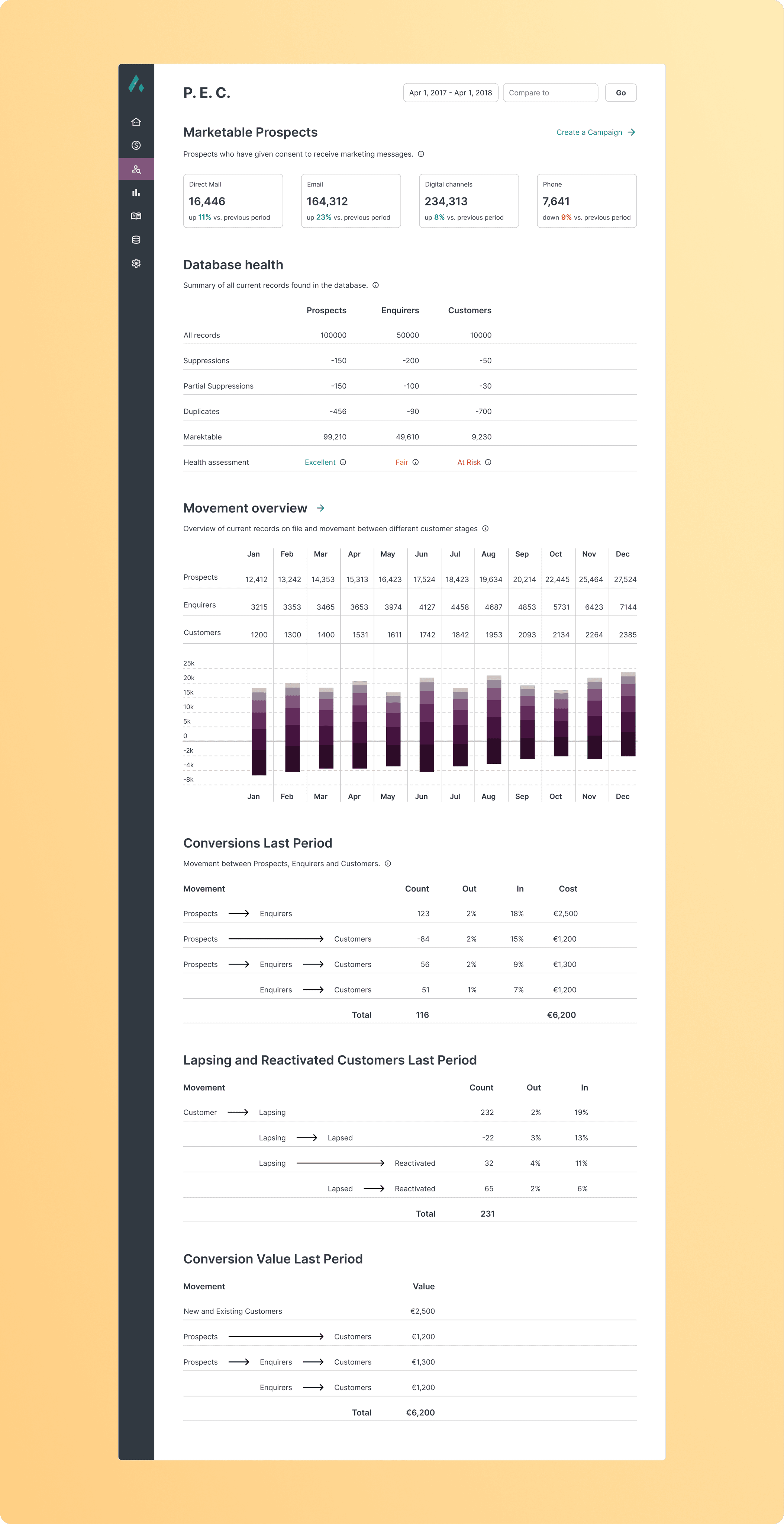
Segmenting customer databases
Dividing the database into three customer groups enables analysis of their relationships.
By tracking changes in Prospects, you can pinpoint the sources of positive or negative shifts in Enquirers and Customers. Customers can belong to any of the groups based on their actions.
This approach also provides a visual representation of the customer lifecycle, helping to identify which areas influence each customer group.
Additionally, it allows you to track movement between groups, revealing where customers are dropping off, how effectively they convert, and the financial impact of transitions between customer states.
Customer segmentation allows to deeper understand each cohort individually and as a collective whole.

First onboarded customer
By the end of the project, we had 1 client onboarded into the system, which helped to understand the process for future clients.
We had started conversations with other potential clients, but our data accuracy wasn't good enough, and their onboarding was postponed.
The most important thing for a data analysis tool is that you can trust the numbers in front of you.
Reflections
Creating data heavy projects is as interesting as it is complicated.
To make best use of each report, we needed to standardise the sales process and agree on a set of metrics which to ask from customers.
Learnings from the project
Data accuracy is hugely important. When you are importing a dataset, there will be issues. Constantly checking data for accuracy was time consuming. We used a few algorithms which combined several data points and those also needed to be manually recalculated before showing the client.
Aligning people is complicated which is why the source of truth was so useful. It helps to show everyone where we are going.
Asking stakeholder sign-off on tech tasks improved the working relationship between management and engineers.
Iterating quickly is a good way to keep conversations going and avoid late redesign.
Aligning managers, marketers, salespeople, and engineers requires a diplomatic, transparent approach that fosters trust and shared understanding.
Next steps
The outcome of the project is a tool that saves time for people whose time is expensive. To understand the usefulness of the tool, more clients need to be onboarded and feedback gathered.
The tool could be productised giving clients autonomy by building an onboarding process, support for internal and external accounts as well as an admin panel.
Over time, simplifying reports and breaking them down in to smaller chunks could help with legibility.
Expanding areas for insights such as customer profiles and product performance could help with warehouse restocking.
Building out the campaign builder could help bring insights from all reports, select a cohort of marketable customers and suggest a channel through which to advertise.