Kinsta
Increased new user signups and reduced time to first code deployment by simplifying the end-to-end product journey and improving service discovery.
Hosting services
4 months
2023

Key results
This project impacted all product discovery journeys and required regular alignment with security, legal, support, marketing, engineering, and other teams.
Decreased the average time from signup to first deployment from 8 to about 3 minutes.
Designed and launched a rebranded end-to-end user journey, unifying product discovery for all services from signing up to the first deployment.
Rebranded and reduced friction in the authentication process to allow more users to access services.
Introduced new features like auto-scaling instances and observability improvements in the logs.
Context
Kinsta, initially a WordPress hosting service, launched an MVP for application and database hosting to meet the demand for custom solutions.
Facing a global decline in WordPress sites and slow adoption of new services due to feature gaps and brand perception, Kinsta shifted focus to make custom hosting solutions its flagship product.
My contribution to support the expansion
Auto-scaling instances to meet demand.
Observability improvements in logs to show more relevant information in an easier to read way.
Streamlining the sign-up process by reducing unnecessary fields to make it easier to try the new services.
Reorganising onboarding to prioritise application hosting.
Investing in a brand redesign and targeted marketing efforts.
The idea was to leverage Kinsta's established reputation as a trusted WordPress hosting platform.
Getting a sense of the scope
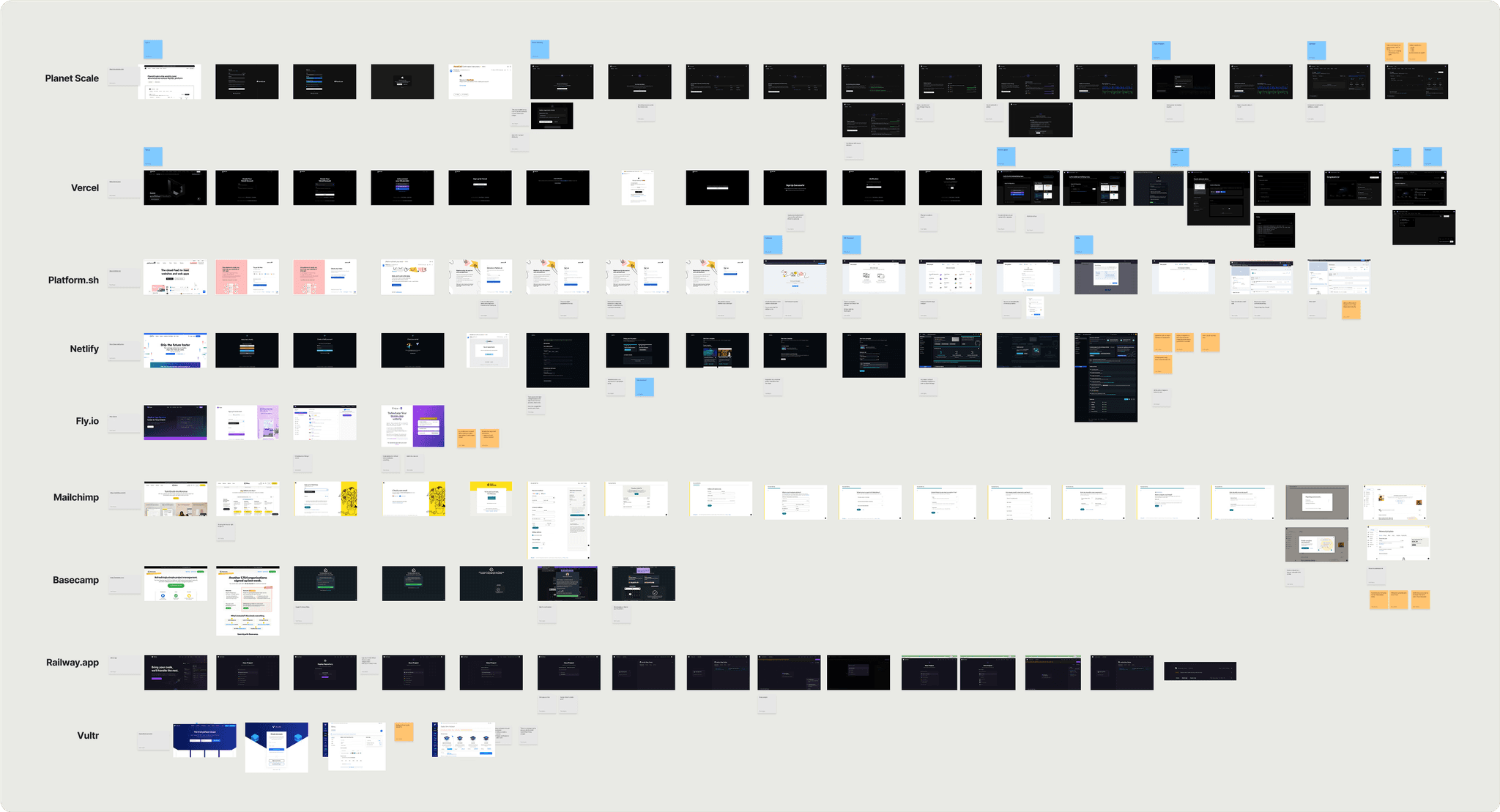
Before any meaningful improvements can be made, it is important to understand the overall deployment experience. I mapped the end-to-end user journey for each of our hosting products from the perspective of a new user signing up and deploying a service for the first time.

Who is the product serving?
Overall, the product journey made sense and had been serving the Wordpress service well. When introducing new services like application and database hosting, it is a bet on a different type of user with different expectations.
Room for improvement everywhere
For databases, the deployment process was the shortest and took the least amount of time. This is partly due to only needing to select a destination path and database size.
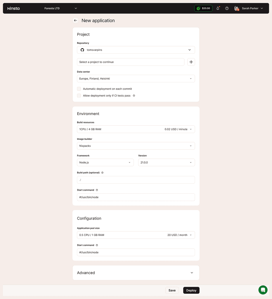
For applications, the user needed to connect to a repository like GitHub using 2FA and find the project to deploy. Deployment configuration was split into 4 steps with varying levels of nested features in modal windows and a mandatory payment step before the first deployment.
WordPress had the most amount of steps and took the longest to get to the first deployment. This is partly due to the configuration process of the WordPress platform, needing to sign up for a subscription plan and go through a lengthy deployment process.
Focusing on the developer experience
The main user persona is a developer testing different hosting platforms who cares about efficiency, feature set and the time it takes to see their project live in a staging environment.
While WordPress users are used to upfront payments, the audience we're targeting with our new services expects a freemium or “try before you buy” model.

Finding a measurement
Successful deployment times may vary from 3 to 15 minutes.
For new signups it took an average of 8 minutes to deploy a project. Deployment times are affected by the number of configuration steps, project size and type, and pre-deployment product exploration.
We chose 3 measurements
Number of signups per month.
Number of deployed projects for a new user.
Time from signup to a successful deployment.
While these measurements were useful for tracking product performance, other teams were measuring the probability of fraud, source of origin, marketing efforts, deployment error rates etc.
Our goal is to enable new users to deploy applications as quickly as possible.
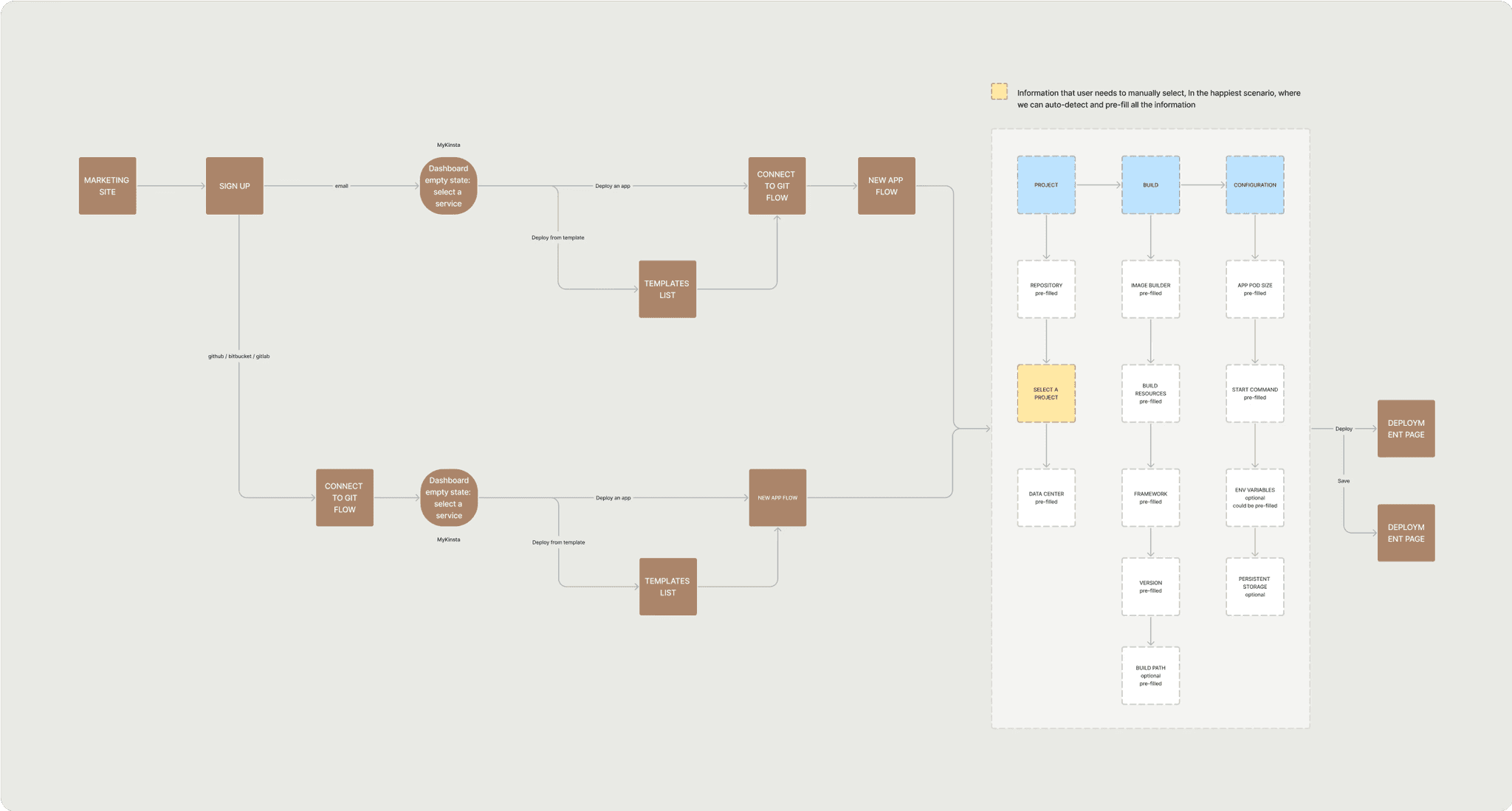
What is a deployment?
While having an average deployment time is a good measurement, to improve the experience, it needs to be broken down into logical, independent steps. This way the whole can be improved by optimising individual steps.
Stages of deployment
(2 min) Signing up and gaining access. Users must enter personal information, verify their email and pay for the selected service.
(1 min) Service discovery. Here users usually explore the platform a little until they find the service they want to deploy.
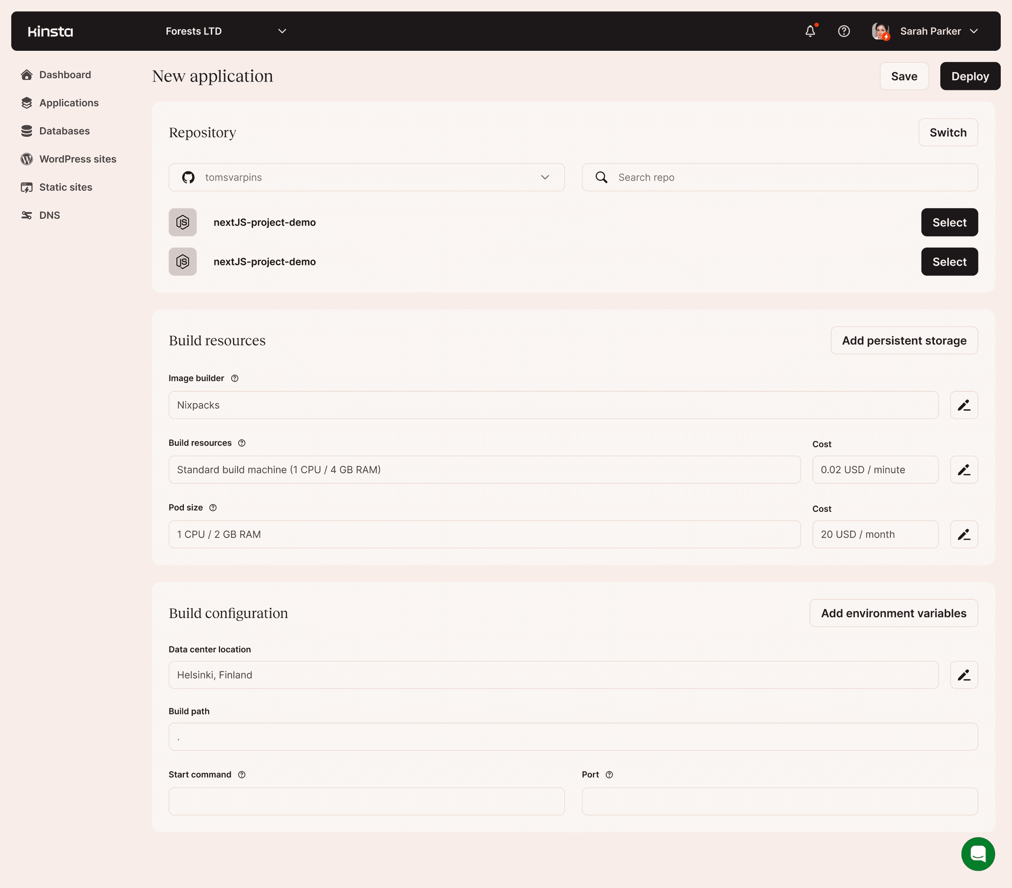
(2 min) Project configuration. Here users connect their GIT repository, set disk paths, choose a scaling policy, and allocate server resources.
(3 min) Project deployment. Here users wait while their project is compiled into a web application. Time varies based on project type and complexity.
We didn’t set specific time targets because the overall deployment time depends on how we measure it. The time frame we take into account, what user groups get included, and the size and complexity of the project amongst other factors.
We need to improve the developer experience by removing barriers to entry, reduce friction, and improve guidance throughout the deployment.
How do we compare in the market?
Overall, we provided a middle-of-the-road experience for new users.
We did not offer the shortest or the quickest way to the first deployment, nor did we offer the most extensive feature set. More importantly, we did not put additional friction in the middle of the crucial first deployment experience.
Developers test many platforms before committing so any friction in the flow can count as a potential deal-breaker.
We can do better
While we don't provide the best in class first deployment experience, we are also nowhere near the worst.
Our sign-up flow was slowing down impatient users.
Some competitors removed the sign up process from the first platform experience, opting to ask for necessary information only after a successful first deployment.
Paying before using is a blocker.
A requirement that worked for WordPress created friction for the new services. However, some competitors kept the payment flow because each time an application is deployed it uses server resources. Lots of abuse in this space from bad actors.
Configuring the project manually is a friction.
All fields required a click to select a value. Competitor flows felt quicker because they made a choice to have a default value for each field. Otherwise, very little customisation options are exposed for the first deployment.
More steps than needed.
While optimising for speed is important, the first deployment serves as a product discovery. Hiding features like auto-scaling and process scheduling might be a blocker for some. Competitors had 2 steps at the most before a deployment would initiate.
Deployment times were slower.
Our deployment times were calculated in minutes while many of our competitors needed under a minute to deploy a simple project.
Hiding features in the name of simplicity can backfire if developers are specifically looking for that hidden feature.
Many low-hanging fruit
The usability audit uncovered many potential improvements. We decided to remove any potential friction points from the main user journeys while, in parallel, working on community-requested features.
We prioritised many small but impactful improvements instead of rethinking the whole experience from the ground up.
Prioritised improvements
Reduce friction in the signup flow.
Remove mandatory payment requirements during signup.
Unify and simplify the deployment processes for each service.
Incentivise users to start using any of our services.
Better guide users through their first deployment.
Provide next steps for what to do while an application is being deployed.
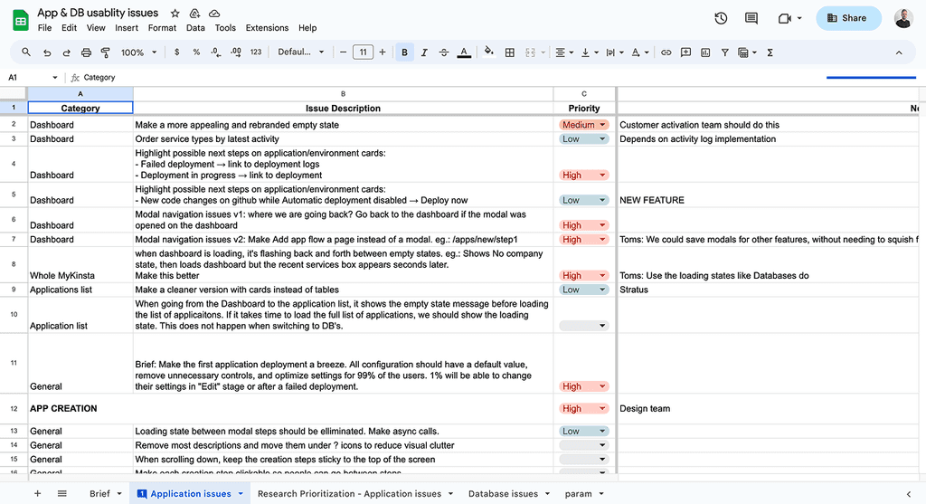
I conducted a usability audit of our live services and identified over 80 issues affecting the core user journeys.

Starting with the sign up
If we reduce friction in the signup flow, more users would land on the platform which could lead to more deployments.
Collecting unnecessary information early in the process introduces friction, which developers tend to be especially sensitive to.

Less friction, more problems?
When entry into a product easy, it can attract bad actors seeking free hosting services that are usually used to host malware.
Removing the credit card verification step, which acts as a fraud deterrent, raised concerns among the security team because they would lose the current method of identifying bad actors.
However, prioritising a frictionless user experience led to implementing alternative abuse detection measures. For instance, limited credits were introduced for initial deployments together with newer tools that heuristically determine potential fraud while running in the background.
Legacy systems can also introduce unexpected constraints. For example, "First name" and "Last name" fields while unnecessary for account creation, over time were used to generate user ID's. Removing these fields would require a lot of investigation and testing that we did not have time for.
Removing barriers to entry can invite bad actors to take advantage of the situation creating a security risk.


Scattered ownership
To make sure all authentication flows share the same design language and components, I needed to coordinate efforts across multiple product teams because different teams owned different flows.
I collaborated with engineers, product managers, designers, and teams from marketing and security to reduce the number of inputs, assess feasibility, and coordinate implementation efforts.
Once the design concept was approved, the design had to be adapted for each authentication flow and shared with the correct team.

Navigating through a deployment
There are 2 main ways users approach application deployment at Kinsta.
Less experienced users would mainly follow the main journey of signing up, exploring the dashboard and eventually selecting a service to deploy. These users would benefit from templates to make things simpler.
More technical users who are looking to see if Kinsta works for their specific use case would authenticate with GIT and would expect to see their own projects as options for deployment.
By deploying their own project, they know where any bugs should be so they can see how the deployment process handles those.
Technical users prefer to test by deploying their own projects, as they know them inside out and want to see how the deployment process handles their specific setup.
Incentivising users to start using services
An insight from the research team was that users who are testing the platform for work would be laser-focused on a specific use case while hobbyists would look at the cost.
To make sure users have all they need, we decided to have most big questions answered upon logging in. That is why documentation and platform credibility elements were put in a sidebar.
Offering free credits for the first deployment would be crucial to encourage new deployments because asking for card details would create friction. Our goal was to remove friction, not to move it around.
New users look for platform credibility, easy access to documentation, performance and cost.

The crucial first deployment
While users were generally satisfied with the original deployment process, we received feedback that improvements and new features are necessary if we want more users and especially businesses to adopt our services.
Most users were content with the existing flow but improvements were always suggested.

Rebrand incoming
During this project, we began a rebranding initiative. The agency focused on marketing aspects but overlooked adapting the concept to our different services.
As a design team, we took on the task of adapting the new design language, maintaining consistency with marketing efforts and updating the design system so it can be used across all product areas.
The main deployment flows were embedded into modals and were generally stable. However, we encountered issues where one modal would open on top of another, close accidentally, or fail to load correctly, causing users to get stuck.
My recommendation was to move functionality within the page and to use modals mainly for feature configuration. Below are some explorations.
The way modal windows were used in the core deployment flow occasionally caused bugs that left users stuck and unable to proceed.


Workshopping concepts
As this was a high-visibility project, buy-in from senior stakeholders was necessary.
I facilitated several design workshops together with engineers, designers and product managers to gather feedback. After incorporating it, I met with stakeholders to get buy-in so I can move on to polish and implementation.
The minimalist
Advanced
Cons: Many configuration options could overwhelm less experienced users.
The detector
Two paths
Offering several design approaches helps shift the conversation from judging pixels to discussing requirements, scope, and value.

New direction emerged
While each concept brings something valuable, it was decided to merge the minimalist and advanced concepts into one.
The motivating factor was to provide just the essential functionality needed for successful deployments, while providing experienced users with easy access to advanced options with a single click.
Minimalism isn’t always the best option. Often, a compromise delivers greater value to a broader range of users.

Exploring while deploying

My concept goes live
The new brand allowed me to play around with new layout ideas like a two-column layout, which would neatly pack all necessary information into a single page.
During the conceptual work, it was decided not to invest in developing new layouts. Once resources were allocated for the change, the two-column layout was embraced and deployed as the main journey.

Reflections
I enjoy taking on big tasks, breaking them into manageable chunks, and delivering each part to see how it contributes to the overall success.
Unifying the entire product journey was a challenge. It required alignment across multiple teams and uncovering many hidden technological obstacles. However, the result was a meaningful impact across the complete end-to-end product experience.
Going through this process creates new understanding and uncovers new knowledge about the untouched parts of the product. It also creates opportunities for housekeeping and reducing technical debt.
Next steps
Unfortunately, layoffs affected my ability to measure the long-term impact. However, in the short term I could observe signals of success.
The time from signup to deployment went down from 8 to around 3 minutes.
The signup process was improved and took less than 1 minute.
Seeing documentation as soon as entering the product, made developers feel reassured that there is documentation, there are credential and certification and that customer support bubble is always available.
Offering free credits gave confidence to try out a deployment which otherwise would require committing a credit card which as I learned is a big blocker.
Users appreciated how simple it is to do a deployment but noted that without seeing the advanced features from the start they were concerned if the service would work for them.