Register of Enterprises
I led the design of a government service from 0 to 1, allowing businesses to digitally sign and submit official documents for the first time.
Government
10 months
2022

Key achievements
As the only designer on the project, I led product work from discovery to hand-off, focusing on incremental iterations to build trust.
I designed the client and admin portals from the ground up.
Led discovery workshops with government employees to understand how requirements translate to everyday workflows.
Conducted user testing for the client portal.
Context
The Register of Enterprises is the government agency responsible for regulating business operations in Latvia. As part of the country’s digital transformation initiative, I designed a system to automate parts of their manual workflow.
The goal of this system is to reduce the time, effort and costs involved in managing legal aspects of companies as well as make the work of government employees more efficient with a better system.
An unclear manual process
When starting a new company or making organisational changes to an existing business, certain paperwork must be submitted for review. The challenge lies in understanding which paperwork is required and how to complete it correctly.
Unclear expectations
People don't know which documents are necessary for their specific situation.
The most frequent support question is about finding the correct document. People usually reach out to customer support with a detailed explanation of their case and receive a response with links to documents.
Submissions are complicated
Once the correct documents are gathered, the next customer support question usually is asking for help to fill them out.
While many rely on accountants to manage the process, not everyone has the means to do so. It requires both an understanding of how to complete the forms properly and the time to deliver them in person.
Mistakes take long time to correct
Once paperwork is submitted and reviewed, applicants receive either an approval or a rejection. However, only 18% of submissions are approved on the first attempt.
A rejection typically indicates an issue with the submission where a field might be missing or filled out incorrectly, or a required document is missing.
Long review times
There are several reasons why responses take a long time.
Each submission needs to physically get to the right reviewer.
Each field needs to be entered into an internal system for verification.
Internal systems don't talk to each other and sometimes other help form colleagues is necessary.
Many submissions are complex, taking a long time to form a verdict.
Verdicts are manually written to internal systems.
Responses are handled by a different department and are sent out the same way the submission was received.
The time required to issue a verdict can be as long as 15 business days, depending on the complexity of the submission.
Limiting factors
The project’s fixed budget and deadline limited the depth of analysis, research, and user validation I was able to conduct.
One of the requirements was to use the IBM Carbon Design System. While it enabled faster iteration, it also limited the aesthetic flexibility. Changes to colors or component shapes often raised concerns about increased development effort.
Concerned about having insufficient time for analysis in later phases, the team began by trying to understand the full system scope. This slowed progress, as many internal processes were still undefined.
It wasn’t possible to involve regular participants from all departments, which led to many unknowns about how their workflows would integrate with the new system.
Each department has their own process
To understand the steps involved in processing a submission, I asked participants from different departments to document their current workflows in as much detail as possible.
Since the system initiative was new, a significant part of the workshops was dedicated to introducing participants to the design process and the context behind the work.

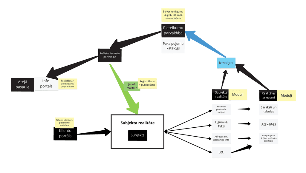
The journey of a submission
A submission is a digital equivalent of all the documents necessary to complete the desired change and is the core around which the systems and workflows are organised.
We defined 5 steps in the journey
A submission is received.
Submission enters the work queue.
The notary accepts a submission.
The submission is actively being worked on.
A verdict has been concluded and client is informed.

Power users need their own flow
All submissions are made on behalf of an entity. While most users manage just one, accountants often work across multiple companies. It became clear that these are distinct use cases and should be handled differently.
Upon logging in, accountants were required to select an entity before accessing the rest of the system. Users without entities would skip this step.
The entity name should always be visible. So it was placed in the secondary navigation which was made sticky across all screens.
Switching between entities had to be very clear. Like closing one book, putting it down and opening another. Confidence needs to be high because a mistake can have legal consequences.
Accountants needed a clear and easy way to switch between entities, ensuring it was always obvious which entity they were working on.

Collaborative system design
I spent significant time with participants to define the necessary details for each step before moving into design. This approach helped build trust, as participants felt their thoughts and concerns were heard.
I divided the system into three parts focused on submission creation. This helped to narrow conversations, allowing for deeper discussions around each feature.
Gathering and filling
Authenticating
Selecting an entity
Selecting relevant services
Confirming selected services
Filling out any required fields
Information validation
Payment and processing
Submission overview
Document management
Document signing digitally
Ability to add additional paid services.
Payment preview
Document signing
This was an external module that we would integrate.

Regular, continuous feedback
After finishing a design, I would document changes from the previous iteration, together with any open questions.
Regular workshops helped participants stay aligned on context and updates, making it easy to gather feedback asynchronously.
At the start of each workshop, we reviewed comments, and all confirmed changes were incorporated into the next iteration.

Many rounds of refinements
Because we had already spent considerable time discussing how each process and feature should work, the first design presentations focused more on walking participants through the agreed functionality rather than collecting opinions on aesthetics.
As expected, once the designs were presented, it was challenging to keep the conversation focused on functionality. Especially with stakeholders who hadn’t participated in the discovery workshops.
Fortunately, those who had been involved helped explain the reasoning behind key decisions and reassured others that all feedback would be considered in future iterations.
Close collaboration and iterative design helps with earning trust and creates advocates who can help with aligning more senior stakeholders.

Helping engineers understand the submission process
One disadvantage of not involving engineers in the design process was the lack of shared understanding and context about how the system should function.
Once engineers started building the logic, I was asked to explain how information would travel through the system.
Sharing the decisions made
The core idea is that information is generated as a submission moves through the system, passing through various validation modules. The process ends with the desired legal change to the company and the publication of updated information to the government’s portal.
Not involving engineers early in the design process leads to a lack of shared understanding.
Information architecture as a measure for scope
The system records all changes made to a company. While all information is accessible, only specific fields can be edited.
To better grasp the scope, I mapped the pages as they appear in the navigation and evaluated which sections were clearly defined and which needed refinement.
I compiled a list of questions and assumptions for each page and assigned it as homework for the participants.
Workshops are valuable, but not every decision needs to be made collectively.

Measuring progress
Outside the main document flow, the rest of the system largely consisted of tables. Because most of them looked alike, I began to confuse one page with another.
To better understand the remaining work, I added each completed page to the information architecture as I finished designing it.
Stakeholders appreciated this approach, as it gave them a clear view of both the progress made and what was still ahead.
Rather than relying on written reports and presentations, stakeholders could take a peek at the information architecture to track progress.

Validating the prototype
I conducted 2 rounds of remote user testing, each consisting of 6 participants.
The participants were experts from different professions who actively use the current submission process.
The objective was to see if experts favoured the new system, and to identify any confusing areas or feature gaps.
Test participants did better than expected
The task was to find the correct entity, select specific services, submit the correct documents, save the submission ID, check the submission status and delegate access to the system.
1 point was given for a successful task.
2 points were given if participants made a mistake.
3 points were given if participants required guidance.
No points were given if a task wasn't completed.
Experts shared that the new system would help them save a lot of time and avoid frustration.

Only positive sentiment
To gather more qualitative data, after participants finished the test, I would send them a post-test survey to fill out.
Every participant answered positively and mentioned that even the functionality in the prototype would be sufficient to improve their existing workflows.
Participants avoided giving a perfect score even if they had no complaints because "nothing ever is perfect".

Multiple changes at once
The main document flow began with selecting the desired services.
Users would then choose a subcategory such as “Changes to an existing SIA,” which refers to updates to an existing limited liability company. Creating a new company, for example, would fall under a different subcategory.
Since the system now allowed selecting multiple services at once, I introduced a “cart” approach that displayed all selected services together, with a prominent “Checkout” button below to proceed.

Documents as form fields
After selecting the desired services, the system generates a long form where the required information is entered.
The form consists of inputs, radio buttons and in some cases an upload field.
Some fields would be auto-completed based on the information available.
Once information is submitted, it is validated through integrations with other systems, which check for data validity, relevancy and accuracy.
Users cannot move forward until the necessary fields are completed. In some cases, it is possible to skip a field by uploading a document in the next step.
A digital form simplifies the process by eliminating the hassle of fitting information into the limited spaces of Word documents.
Validating inputs
Getting to this step means that previously entered information successfully passed the initial validation.
The entered information is then used to generate documents that require digital signatures. Each document must be signed individually using a third-party tool, and the system prevents users from proceeding until all documents have been signed.

Automatic submission review
The main benefit of the new internal system for reviewing submissions is the automatic information validation that occurs during the submission process.
Each submission displays validation outcomes, categorised by severity:
Red indicates critical issues. These submissions cannot be reviewed and must be returned for corrections.
Yellow highlights partial mismatches. Only the incorrect parts need to be revised, while the rest can still be evaluated.
Green confirms that the submission passed validation with no issues.
Automated submission validation saves time by replacing the manual validation process used in the past.
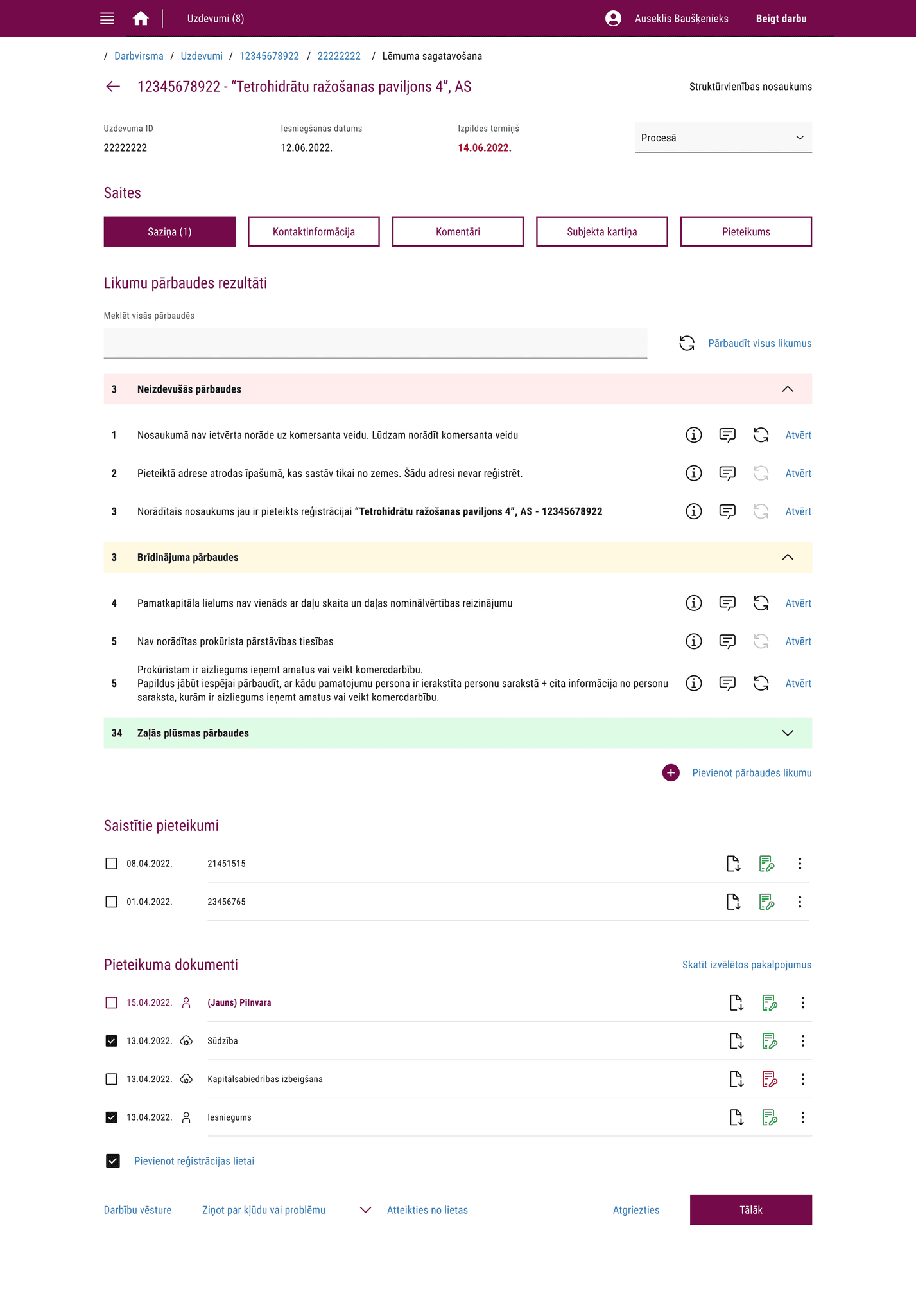
Verdict templates
Issuing a verdict typically takes several days and often involves two or more people, depending on the complexity of the submission.
Notable improvements
Notaries can now collaborate on the same submission without needing to close their review session for another notary to continue. This streamlines teamwork and reduces duplication of effort.
Finding the appropriate law to support a verdict is now much easier, thanks to a searchable database that allows quick and accurate linking.
Verdicts can be sent to multiple people using different delivery methods. Before each verdict was sent separately the same way it was received (physically, email, digital address etc.).
Verdicts can now be sent to multiple recipients using different delivery methods. Previously, each verdict had to be sent separately and only via the same method it was received - physical mail, email, or digital address. The new system supports mixed delivery methods, saving time and ensuring broader reach.

Continuous improvements
This project covered the first two phases of the digitalisation plan.
For the client portal, upcoming phases will focus on expanding automatic validations, increasing service coverage, and reducing the amount of manual data entry by improving integrations with other government systems.
For the admin portal, a dedicated research project is planned to evaluate how effectively the new system supports current workflows and to identify necessary changes.
It was acknowledged early on that a new system would introduce many unknowns—so instead of overengineering from the start, the team opted for a flexible approach, allowing for thoughtful, data-driven adjustments over time.